Toggles should be a browser feature
As part of designing the No Script Show's website I talked before about light and dark themes and briefly on adding a toggle switch.
Here I'm looking more closely at the implementation and sharing some alternative code.
I skimmed over this topic before because it was getting far away from what our show is about (i.e. how easy it's becoming to make effective sites with only modern HTML and CSS).
Everything I encountered doing this led away from this and to me strongly agreeing with Bramus Van Damme (a Developer Relations Engineer at Google) that these per-site toggle switches should be a browser feature. This was something rumoured to be coming to Safari a few years back around the time Bramus was raising this.
Ideally I would like to see Bramus and Luke Warlow's "proof of concept" Chrome extension getting more attention to show browser vendors that the demand is there.
If we look at how complex it can become for non programmers to implement a dark/light switch properly I think it makes their case.
Modern CSS makes it easy for us to create dark and light themes with CSS color-scheme and the "prefers-color-scheme" media query to honour a users system preference. But in giving us this it creates the demand to offer this option via a toggle on our own individual sites.
Doing this creates a dependency back to custom javaScript and we have to either duplicate our dark and light theme code or in the case of javaScript failure have to ignore the user's system preference.
We have to compromise when working with dark and light images (which I will cover next time on this mini-site ) and we have additional accessibility considerations which I am focussing on here.
The Ultimate Theme Toggle
The code I am using here comes from Salma Alam-Naylor's (slightly tongue in cheek) The Ultimate Theme Toggle™️ . Equally I could have gone with Adam Argyle's Dark and Light Theme Switch shared on Google's web.dev and used on his personal site too.
I've made some additions to Salma's code which I have included in the article that goes with the video and we explain them here.
I've also been looking at two other dark and light switches from to two other developers I admire: Una Kravets personal site and CSS in real life by Michelle Barker .
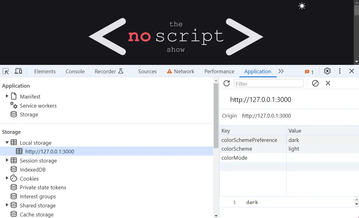
All of the above are similar to what I shared before. They all use a HTML button for the switch, they all try to honour the user system preference first and use the browser's local storage to hold changes in preference.
I'm not sure why all chose a button over a checkbox input used on some other solutions. I doubted the semantics of my own button choice. It's probably irrelevant, but even here we have division on how to do a two option switch.
Michelle Barker's CSS in real life site is closest to what I shared before in that it has a default light theme and the javaScript adds a class selectors for the dark theme styles. She goes one step further in adding duplicate CSS in a “prefers-color-scheme” media query so it still works if javaScript fails or is turned off.
Note: Even with Bramus and Luke's chrome extension checking that light and dark themes are working properly in all situations is a pain. We have to keep clearing local storage
The other three are different in that they use data attributes: [data-theme="light"] and [data-theme="dark"] instead of a CSS class selector.
As browsers might support a media query for “no preference” I can see the sense in grouping themes like this rather than having a default and an alternative, but, of course, what's best depends on the situation.
Adding icons
Salma gives us all the code we need on Codepen but the text version without icons. On her own site she adds icons as decorative background images.
This is not something I will say often, but I went with the Chat GPT suggestions to add these icons to the button's HTML via the javascript.
This might be OTT as Salma Javascript provides a nice dynamic aria label that explains the button.
My addition allows the screen reader users to hover over the icons and hear what they are and what they do, via the icon alt tags (which are also dynamic)
The other 3 sites mentioned have SVG's hard coded into the buttons so there are no alt tags there.
If they wanted the icons announced they could have added an aria labelledby that reference to a title added to the SVG. They have not, which does leaves me thinking I have over complicated this
If you want to use my version so you don't need to add the icons via CSS you could remove them from screen readers by adding aria-hidden="true" to the icons (only shown in the video so I don't forget)
Toggles suck!
I'm not going to get into UI here. There's a lot of articles about the usability of toggle switches. This one called toggles suck seems to do a good job of bringing together what others have said.
I'd rather see the best people in accessibility working with browser vendors to create a convention we all could understand and use.
Nathan's impression was that side to side toggling had become the norm. He could be right, certainly there was a run off fancy Codepen toggles like that, but here there are all single icons ( Adam and Una both have cool SVG animation).
We'll go with the least attention grabbing and space saving approach as there are probably better things for the visitor to get focussed on.
No javascript
With Salma's code we set a fallback theme in the HTML if javaScript fails:
<html lang="en" data-theme="light">
The user device preference is not honoured (unless that matches what we have set.)
On the personal sites for the others they have duplicated the CSS That is, they have:
 @media (prefers-color-scheme: light) {
/* All the light rules*/
}
AND
[data-theme="light"]{
/* All the light rules again*/
}
If we want the same we need to add some additional JS.
<script>
 // Inline script to set the initial theme based on system preference or local storage
(function() {
 const localStorageTheme = localStorage.getItem('theme');
 const systemPrefersDark = window.matchMedia('(prefers-color-scheme: dark)').matches;
 const theme = localStorageTheme ? localStorageTheme : (systemPrefersDark ? 'dark' : 'light');
 document.documentElement.setAttribute('data-theme', theme);
 })();
 </script>
I got Chat GPT to do this. It's probably best to let the browser read this first. I have to put this in the head. Also I have to place the prefers-color-scheme media queries first in the CSS.
We will probably stick with Salma's approach. The CSS duplication seems fine for a few colours, but if you get into swapping icons and images based on dark and light preference the code and maintenance starts adding up.
No JS - no toggle
I have altered Salma's code to hide the toggle when there is no JS. The button has an inline style of display:none;which is changed to display:block; by the javaScript. This removes it from the accessibility tree for screen readers too.
Focus state
In an earlier video I mentioned the new focus-visible pseudo class to let the browser remove ugly focus rings when a sighted user does not need this visual clue. This is generally one to go for, but here we have an exception as the button here is not being styled in the regular way and we need people to tab to it and change it with the keyboard. I added it this way:
  :focus-visible:not(toggle){
    /* Styles */
 }
Toggle Animation
We don't have much animation here, but still I have added @media (prefers-reduced-motion: no-preference)to this so it only shows for people who do not set this to reduced or no motion.
Aria Live
Finally noticed on Adam Argyles's personal site and also Una Kravets they had added aria-live="polite". It's not included in Adams web dev article.
Aria live gives screen readers an update of regional changes they might not otherwise be aware of because the reader is focused elsewhere.
For example if a checkout form has an input to add something that will alter the price positioned elsewhere in the region the changed price will be announced (politely) when the input is checked. It's likely that sighted users would be looking at price when clicking elsewhere and this brings this ability to non sighted users.
After trying it with the NVDA (an open source screen reader that is also the most used) I felt adding this might be annoying or even more confusing in this situation.
If I enter in light mode without aria live the screen reader announces "switch to dark theme button" if I enter or click it says "switch to light theme". I Imagine most would understand what's happening on the first change.
Also If hover over the icon it says it is a sun icon that switches to a dark theme.
If I add aria live NVDA says switch to light theme 3 times and automatically reads the new alt image tag too. It could be my ignorance using NVDA, but I did not like how it worked with my solution.
Conclusion
Trying to get a toggle to work well pushed me beyond my skill set and toward feeling less certain in what I am doing. I think that alone backs up Bramus’s argument for browsers to do this.
As dark and light themes become increasingly becoming a standard I’d rather be focussing on doing better designs with the same CSS as everyone rather than going it alone with my own custom JS hacks.
I feel more sure of this after seeing a couple of these switches made for the massive WordPress audience that have not taken anything the care the people I feature here have. Previously, I would have excitedly jumped on these taking it for granted that I was aiding accessibility
Whilst I don't think this is as bad as the way things went with the accessibility overlays market (which I am sure was well intended originally) but, I think some early standards might avoid a similar thing happening . Rant over!